ShopDreamUp AI ArtDreamUp
Deviation Actions


Suggested Deviants


Suggested Collections


You Might Like…


Featured in Groups

Description
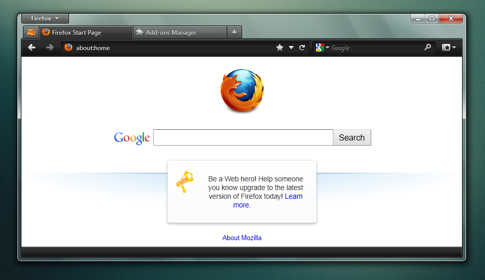
A theme for the mainstream.
The most popular themes on AMO are dark, and I notice that a great number of you guys like the squared options in Stratiform. It probably has to do with some primal love of sharp, pointy dark objects that we have all had since we stepped out of that wet stuff we call the ocean (for those of you who agree with Darwin's theory of evolution).
So anyway, with all the time and effort I (and ~SoapyHamHocks, the co-dev of Stratiform, FoxE9, etc.) have put into our stuff, we only get less than a tenth of the user base of these popular themes. Hence I have come up with this mainstream, pleasant-for-everyone-that-doesn't-really-care-about-how-their-browser-looks-so-long-as-it-is-different-and-dark-and-has-pointy-edges theme.
Hence, it has a fitting name. Espada means "sword" in Spanish and is also the name of a model of Lamborghini, which are loud, obnoxious looking cars that everyone wants because they go fast and look cool.
So keeping in mind my goals, which are to:
 Appeal to as many users as possible
Be dark, sharp and obnoxious to look at
Keep the default interface mostly intact and just change the things that won't make it incompatible with major add-ons
Be easy get used to and use
What do you think?
Update:
Tweaked the gradients
Made the text fields rounded and deeper looking
Added gloss... EVERYWHERE
More metallic looking icons
Softer text shadows
Tab bar now has a glow behind it
Another update:
Old mockup got corrupted, started fresh
All toolbars have 1px curved edges
Tabs have bottom curves that curve away from the selected tab (similar to Safari)
Inactive tabs are lighter in colour
Selected tab curves at the bottom and has a stronger highlight
Tab bar glow has been removed (mostly due to laziness)
App menu button is styled like the inactive tabs to allow for a better hover and pressed state
Nav bar is 1px shorter
Text fields are 2px taller
Text field icons have more spacing to replicate how it would have to look in the theme (even if it does look worse)
More spacing between the toolbar icons to replicate how it would look in the theme
Icons are now glossy
The most popular themes on AMO are dark, and I notice that a great number of you guys like the squared options in Stratiform. It probably has to do with some primal love of sharp, pointy dark objects that we have all had since we stepped out of that wet stuff we call the ocean (for those of you who agree with Darwin's theory of evolution).
So anyway, with all the time and effort I (and ~SoapyHamHocks, the co-dev of Stratiform, FoxE9, etc.) have put into our stuff, we only get less than a tenth of the user base of these popular themes. Hence I have come up with this mainstream, pleasant-for-everyone-that-doesn't-really-care-about-how-their-browser-looks-so-long-as-it-is-different-and-dark-and-has-pointy-edges theme.
Hence, it has a fitting name. Espada means "sword" in Spanish and is also the name of a model of Lamborghini, which are loud, obnoxious looking cars that everyone wants because they go fast and look cool.
So keeping in mind my goals, which are to:
What do you think?
Update:
Another update:
Image size
950x548px 178.53 KB
© 2012 - 2024 muckSponge
Comments89
Join the community to add your comment. Already a deviant? Log In
" Be dark, sharp and obnoxious to look at"
...this is the Kanye West of Firefox themes?
Just kidding - it looks amazing. I can't wait till you finish it.
...this is the Kanye West of Firefox themes?
Just kidding - it looks amazing. I can't wait till you finish it.